17 Feb 2025

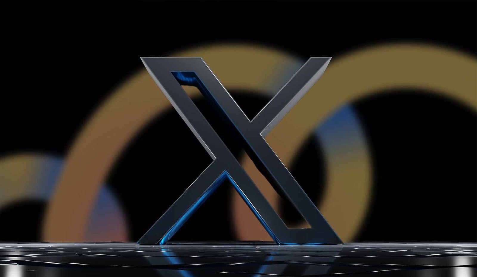
Ah, change. It’s exciting, bold, and forward-thinking, or, at least, that’s how it’s supposed to feel. But when the Twitter’s logo redesign introduced the new “X” logo, the response was less wow and more why? The beloved blue bird called ‘Larry’, which symbolised connection, simplicity, and community was swapped for a sharp, stark “X” that feels more like a random placeholder than anything remotely related to what the platform stood for until now. Bold move? Sure. Smart move? Debatable.
At Creativate, we believe design isn’t just about what looks good. It’s about functionality, strategy, and understanding your audience. So, let’s unpack why the Twitter redesign has become a cautionary tale for brands everywhere, and what we can all learn from it.
Change can be risky, especially when it disrupts something iconic. For years, Twitter’s blue bird wasn’t just a logo; it was the face of a global platform. It represented communication, connection, and, let’s be honest, a little bit of chaos. So, replacing it with an “X” was always going to be a gamble.
Here’s the catch: people rarely love change, especially when it feels unnecessary. Twitter’s audience wasn’t asking for a new logo. They were asking for practical features, an edit button, for instance. Instead of delivering those requests, Twitter handed them a whole new brand identity. It’s almost like asking for a cup of tea and being served a glass of warm soda instead.
At the heart of any successful redesign is a robust process. Research, user feedback, and strategic planning ensure that changes align with both brand values and audience needs. Unfortunately, the Twitter rebrand seems to have skipped a few of these steps.
The timeline says it all: one day, Elon Musk decided it was time for a new visual identity. Hours later, the bird was gone, replaced by the X logo. No extensive user testing, no gradual rollout, just a design overhaul that left users scrambling to figure out what had happened.
The result? A logo that may look sleek but feels disconnected from the platform’s identity and purpose.
Twitter’s redesign didn’t stop at the logo. The changes extended to fonts, colour schemes, and buttons, all under the banner of “accessibility.” While it’s commendable to prioritise inclusivity, execution matters.
While some of these changes addressed specific accessibility needs, they inadvertently created new barriers for others. A more thoughtful approach, one that allowed users to customise their experience, could have avoided this.
Twitter’s redesign is more than just a questionable aesthetic choice; it’s a reminder of how critical user experience and process are in branding. Here are a few takeaways for businesses:
At its core, design is about solving problems and connecting people. It’s about aligning aesthetics with functionality, and strategy with practicality. While Twitter’s redesign has certainly sparked conversation, it’s also highlighted what happens when the design process is rushed, and user needs are overlooked.
So, if there’s one thing we can thank Twitter (or X) for, it’s this valuable lesson: good design isn’t just bold, it’s thoughtful, purposeful, and inclusive. At Creativate, we champion designs that not only look great but also work brilliantly for the people who use them. Because in the end, design isn’t about making a statement; it’s about making an impact.